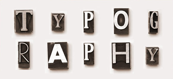
In most cases typography either makes or breaks a lot of projects. After you have done all of your brainstorming and your sketches, you should move to the typographic side of the project. Identify which typefaces you’ll be planning on using, or which typeface you like but to modify to make it unique and just the way you like it.
The typeface, to the conscious mind, is very subliminal and very often overlooked. All-too-often, I, as a designer, notice the usage of fonts that are hard to read or are otherwise visually problematic in some way. While the viewer may still read that message the front is bringing, he or she may be unconsciously left with and different impression of the piece than the designer intended. A good graphic designer will go to great lengths to find the best font to ensure the selection and construction of the type complements the mood of the piece and accurately communicates the intended message.
How to choose the right typeface
A great way to go on about picking a typeface, I’ve found, using what I call the thumbnail method. You pick the typefaces that you will think will bring a lot of emotion to the project and will work well with other project components. Usually starting from about 20 or so different typefaces, and slowly narrowing the field down to the ones that work the best. A typical print piece or usually need have no more than 3 to four different fonts throughout the piece and it’s very important that they all work together and complement each other. Sometimes, the best look is achieved by using all serif fonts throughout the piece and sometimes a sans-serifs are the way to go. Often, a mix between the two also delivers a nice effect.
Font Solutions
Of course, the trickiest font solutions are for logos. Sometimes it takes previewing a 100 different typefaces to find the perfect one. The play of each letter against the next is so important in a logo. The relationship between the transition of a one letter to another can make all the difference in the success of a logo design. So when choosing a type face for a logo, remember the each letter is too important to ignore. Once you choose a font for a logo, you may then want to bring it into an application like Adobe Illustrator and further modify it to convey the intended message.
Typography becomes more challenging when designing for the web. Although we’ve improved since early HTML days, web design still limits typographic choices. Designers often have only about 20 fonts available. However, Web 2.0 advancements like CSS 2 have expanded possibilities. Solutions like Google Fonts now let designers load specific fonts into a site, forcing browsers to display content with those fonts.
Typography is truly one of the most important elements of graphic design. Whether designing for print, branding or for the web it is very important to do your due diligence on what fronts are the best choices for presenting and showcasing the message you intend to deliver.


