Like diamonds, the most successful logos behind some of the world’s most powerful brands have 5 common characteristics: Clarity, Color, Cut, Authenticity, and Simplicity.
Let’s take a deeper dive into each of these characteristics and how logos successfully build your brand identity.
1. Clarity
A company’s logo should be clear, simple and easy to read. When you begin digging around for great logo brand identity design, you’ll probably find that the most powerful and memorable brands tend to have very simple logos.

2. Color
Color is a very important tool for any brand. It’s important that your logo work in black and white as well as color. However, the power of color should never be overlooked. Colors are emotive. I’d even go so far as to argue that logos have a subliminal effect on human psychology. Many successful brands use color effectively. As yourself, are your brand’s colors helping or are they working against your brand’s message?

I have some free time on my hands so I think I’ll just gaze up at the blue sky and ….. Play on the internet.
It’s no accident that these brands in the image above all share similar colors. Sky blue tones convey lightness, playfulness, imagination, and creativity while darker blues convey a trusted, serious, and “get down to business” sort of message.

The navy blue of Merrill Lynch bull says “Trust us with all your money!”
3. Cut (or Symmetry)
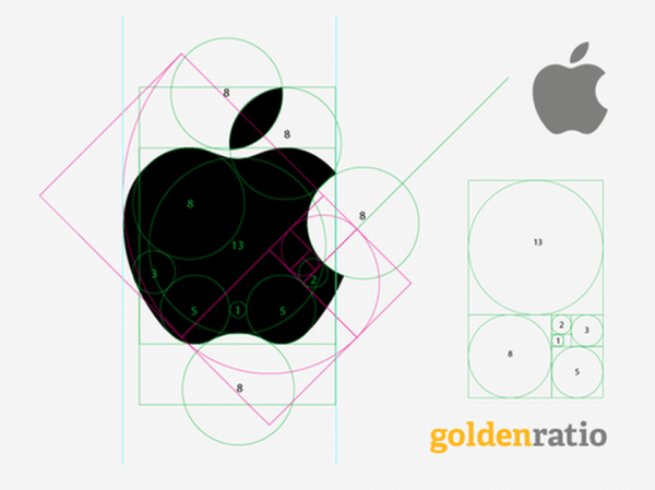
The cut of a diamond affects how it refracts light. This has everything to do with symmetry and balance. Let’s take a look at how one logo designer used balance, symmetry and proportionality to create the success that we know today as Apple®.

The Apple® logo adheres to the “golden ratio” 1/1.5 perfectly.
4. Authenticity
Is your logo unique while remaining reflective of your business? A successful logo should be completely unique and unlike any other. While it’s OK to look for inspiration and new ways to re-imagine existing ideas, you should never seek to copy another logo. However, it’s entirely possible to use commonly recognized symbology in unique, creative ways. In 1968, Target corporation laid claim to the iconic bullseye. Since then, it has enjoyed a timelessness in its clarity and authenticity. It’s so fused to their brand identity that it’s almost impossible to see a bulls eye image without thinking of this mega retailer.

The iconic bullseye is a perfect example of clarity, simplicity and authenticity in logo design.
Simplicity
Above all, a good logo should be simple! As designers, we should ask ourselves “What else can I take away? How can I boil this down to the basics?”. Logos will rarely be used in the same media all the time. Therefore, they need to work in variety of different placements, sizes, and colors. A logo should not rely on color to convey its style. It should work well in both full color or black and white. The more complex the design, the more you limit your use of the logo.

When it comes to logo design, the quality of your design has a direct connection to the effectiveness of your brand identity.
Is your logo simple and easy to read? Can it be used effectively both in color and in straight black? How does your logo score on the diamond scale?


