High-end websites are not just about beautiful design. They use spacing, typography, structure, and strategy to create trust, guide visitors, and turn attention into action.
What Actually Makes a Website Feel High End?
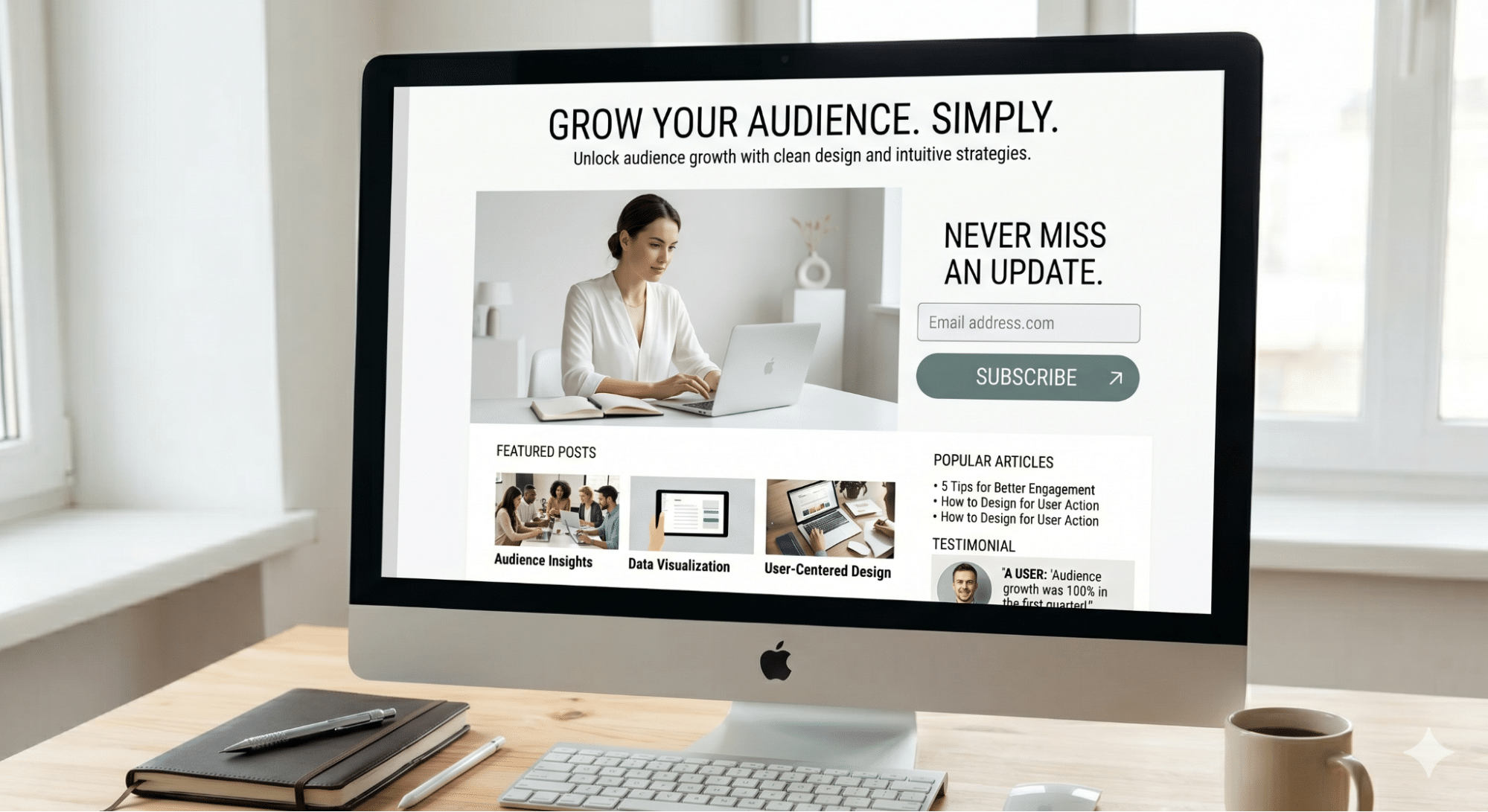
There is a moment you have probably experienced before. You land on a website and, within seconds, it feels premium. Not flashy. Not loud. Not overly designed. Just elevated.
The interesting part is that most people can feel the difference almost instantly, even if they cannot explain exactly why.
That feeling is not accidental. It is also not simply about having an expensive-looking design. A high-end website is created through intentional decisions that shape how people experience your brand, your offer, and your level of credibility.
From spacing and typography to structure, clarity, and brand positioning, every detail works together to create one thing: trust.
Let’s break down what actually makes a website feel high-end.

Spacing Is Doing More Than You Think
The first thing your brain notices on a website is not always the color. It is the space. High-end websites usually use more breathing room than people expect. Not because the design is empty, but because it is intentional.
You will often notice generous margins, clean sections, balanced layouts, and content that does not feel like it is fighting for attention. That space creates clarity. And clarity feels expensive.
Lower-quality websites often try to fit too much into one screen. More text. More buttons. More images. More sections. More everything. But when everything is competing for attention, nothing feels important.
A premium website gives each message room to matter. It allows the visitor to understand what they are looking at, where to focus, and what to do next.
That is why white space is not wasted space. It is part of the strategy.

Typography Shapes the Entire Experience
Most people underestimate typography. But typography is one of the first ways a brand communicates personality, even before someone reads the actual words.
A high-end website does not need ten different fonts to look impressive. In fact, premium websites usually do the opposite. They rely on one strong primary font and, when needed, one supporting font.
The difference is in the refinement. Font size, line spacing, letter spacing, headline hierarchy, and paragraph width all influence how a website feels. When typography is done well, the site feels editorial, polished, and easy to read. When it is done poorly, even a beautiful layout can feel unfinished.
You will rarely see a truly premium website using random font sizes, overly bold headlines on every section, or default fonts with no personality. The typography feels controlled because it is controlled. It guides the eye. It sets the tone. It makes the content easier to absorb. And when a website is easier to read, it immediately feels more trustworthy.

Restraint Is the Real Flex
This is where many websites go wrong. They try too hard to prove they are good.
They add too many animations, too many colors, too many sections, and too many design effects that serve no clear purpose. But high-end design is not about adding more. It is about knowing what to remove.
A premium website constantly asks one important question: Does this need to be here?
If the answer is no, it does not belong. That level of restraint creates confidence. It tells the visitor that the brand knows exactly who it is, what it offers, and what matters most. Nothing feels desperate. Nothing feels random. Nothing feels forced. The result is a website that feels calm, intentional, and elevated.
A Premium Website Is Not Decoration. It is decision-making.
Here is the part most people miss. A high-end website is not just visually clean. It is mentally easy. Every section should help the visitor answer a question.
What is this brand?
Is this for me?
Can I trust them?
What makes this different?
What should I do next?
When a website is strategic, every element has a job. The headline creates clarity. The visuals support the message. The layout guides attention. The call to action makes the next step obvious.
Nothing is placed there just to fill space.
This is the difference between a website that looks good and a website that actually converts. Low-performing websites decorate. High-performing websites guide.
Why Good Looking Websites Still Do Not Feel Premium
Many websites check the basic design boxes. They have nice colors, decent images, and a clean layout. But something still feels off. Usually, it is because the deeper decisions were not refined.
Maybe the spacing is inconsistent. Maybe the typography does not feel polished. Maybe too many elements are competing for attention. Maybe the hierarchy is unclear. Maybe the brand message is too generic. So the website looks fine, but it does not feel valuable. And in business, that feeling matters more than most people realize.
A visitor may not consciously say, “The line height is wrong” or “The visual hierarchy is weak.” But they will feel hesitation. They will feel unsure. They will feel like something is not fully aligned. That hesitation can be the difference between someone booking a call, making a purchase, or leaving the site entirely.
The Bigger Issue Is Usually a Lack of Point of View
This is where everything connects. A high-end website reflects more than design taste. It reflects positioning. It should communicate who the brand is for, what the offer solves, why it matters, and why someone should trust it. Without that, design becomes decoration. And decoration does not convert.
A beautiful website with unclear positioning will still feel weak. A visually clean website with vague messaging will still lose attention. A modern website without a clear strategy will still struggle to convert visitors into clients.
Anyone can make something look pretty. Very few brands take the time to make something intentional. That is what creates the premium feeling.
Final Thought
If your website looks good but does not feel high-end, it does not always mean you need to redesign everything from scratch. Sometimes, the real work is more strategic. It is about removing what does not belong. Refining what does. Clarifying the message. Improving the structure. Strengthening the visual hierarchy. And making every decision on purpose. Because the premium is not louder. Premium is clearer.
Build a Website That Actually Converts
At 90 Degree Design, websites are not built to just look good. They are built to position your brand, guide your visitors, and turn attention into action.
If your website feels almost there, that is usually where strategy comes in.
Start here:
References
Google Search Central, SEO Starter Guide
https://developers.google.com/search/docs/fundamentals/seo-starter-guide
Nielsen Norman Group, Web Usability
https://www.nngroup.com/topic/web-usability/
Baymard Institute, Readability and Optimal Line Length
https://baymard.com/blog/line-length-readability
Stanford Web Credibility Guidelines
https://credibility.stanford.edu/guidelines/index.html
Baymard Institute, Ecommerce UX Research